Chapter 2. Working With the WebView Application
2.1. Quick Start
Here is a brief example of how to start the WebView application, add a control to a page, edit a property and animate the control with live data, and then save and view the resulting page.
2.1.1. Start the WebView Application
You have two options for starting the WebView application:
Once the WebView application is started, you are ready to begin building pages.
2.1.2. Add and Modify a Control
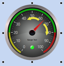
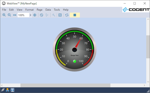
Find the Circular Gauge 2 control button among the controls in the editor, and click it.
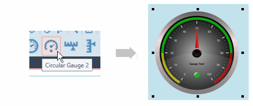
A copy of the Circular Gauge 2 control will appear in the blank page.
Now let's adjust a property of the gauge. In the Properties list on the left, find the Scale Properties, expand the list, and in the Scale Label Font Size, enter
20.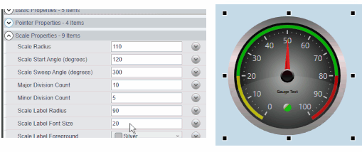
Press Enter, and the font size of the numbers on the gauge will expand to 20 points.
See also Section 2.4.3, “Control Properties” for more details about working with control properties.
2.1.3. Bind a Control to a Data Point
Many of the WebView controls can be bound to certain variables, so that whenever the variable changes, the value or appearance of the control changes as well. For example, a gauge or meter can be bound to a DataHub point to display changes to the point in real time. In this example we bind the gauge we created above to display the value of the DataPid point Pv.
Start the DataPid program that is included in your Cogent DataHub archive to generate some test data.
Open the Basic Properties of your gauge, and click the arrow button on the right side of the Current Value row.
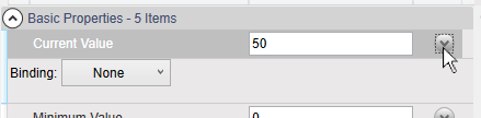
A Binding selection box will appear.
In the Binding selection box, click the down arrow to open the list, and select Point.
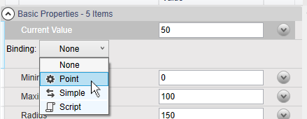
This will activate the point selection entry field.
We want to connect to the DataPid point DataPid:PID1:Pv, so enter just Pv. All the points that have "
Pv" in their names will appear.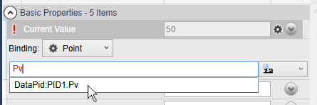
Select the point DataPid:PID1:Pv. Once selected, the data will start updating in the value entry, and the gauge needle will start to move.
See also Section 2.4, “Controls” for more details about using controls, or Section 2.5, “Property Binding” for binding data them to DataHub points.
2.1.4. Save and View a Page
To save the page, you can click the Save button
 , or choose from
the menu, or press Ctrl +
Shift + S.
, or choose from
the menu, or press Ctrl +
Shift + S. 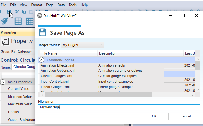
Specify a file name for the page.
![[Note]](images/note_1156523861.png)
Any page created in WebView version 1.4 and earlier (that was distributed with DataHub version 7.x) gets upgraded to the current version of the WebView application as soon as it is opened. If you save this page, the conversion is permanent, and you will be unable to load the page in the older version of the WebView application. If you expect to revert to the older version, you should create a backup of your page before saving it in the latest version of the DataHub program.
To enter Run mode and view your page, click on the button
 or press Ctrl +
Shift + R.
or press Ctrl +
Shift + R.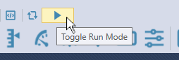
Your page will appear in the web browser as a user would see it, with all the controls fully animated and functional.
To exit Run mode and return to Design mode, click on the button
 or press Ctrl +
Shift + R.
or press Ctrl +
Shift + R.
See also Section 2.3, “Pages” for more details about saving and viewing pages.
2.1.5. Add a Symbol
Find the Symbol control button near the end of the list of controls, possibly in a drop-down list. and click it.
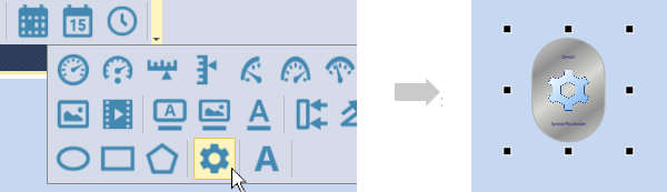
A copy of the Symbol control will appear in the page. This one control can be used to represent any symbol in the symbol library, which contains thousands of different symbols.
In the Properties list, for the Symbol Set, choose Symbol Factory. For Category choose , and for Symbol, choose .
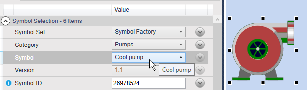
The generic symbol icon should change into a symbol of a pump.
2.1.6. Bind a Control to another Control
Most controls can bind their properties to other controls, so that when the first control is modified, the bound control gets modified automatically. Here's an example, binding the value of the pump we just created to the value of the gauge.
Click the gauge, and in the Basic properties, right-click the Current Value row, and select .
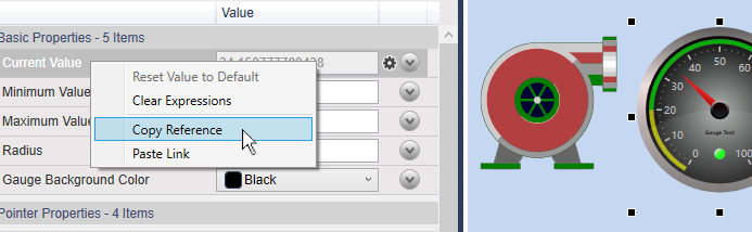
Click the pump, and in the Input properties, right-click the Input Value row, and select .
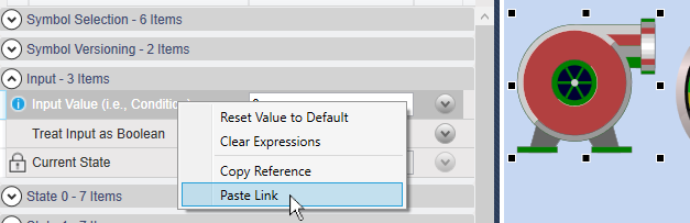
The pump will take the same values as the gauge, and turn green, the default non-zero color for this symbol.
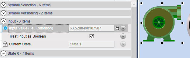
Notice that the Current State is State 1, for
True. This default can be changed, as explained below.
See also Section 2.5, “Property Binding” for more details about binding control properties.
2.1.7. Set Symbol States
Most symbols can be set as booleans, to show on/off states, and many can also display multiple states. Here we'll change the default boolean settings and colors of the pump to display three different states.
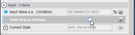
Click on the pump, and uncheck the Treat as Boolean box.
In the State 0 properties, for Value Is Less Than or Equal enter a value of
25. Then change the Color to .
In the State 1 properties, enter a value of
80and change the Color to .In the State 2 properties, enter a value of
100and change the Color to .
Now, whenever the gauge value is between 0 and
25, the pump highlight color will be yellow,
26 to 80 medium sea green, and
81 to 100 red. Notice that for each
state you enter the maximum value, while the minimum value is controlled by the
previous state.