3.23. Quick Trend

|
The QuickTrend option lets you create a live trending graph for any number of data points in any DataHub data domain. It automatically configures the DataHub Historian or the selected External Historian for all enabled points. You can configure the X and Y axes of the graph, zoom in on a particular area, and apply offsets and scales to raw data to plot widely disparate values together in a single chart. |

To configure a quick trend, press the button:

Configuration
QuickTrend supports multiple display configurations, which you can manage using the Configuration options. The top button opens a dropdown list that contains all named configurations. The , , and buttons let you create, rename, and delete configurations.
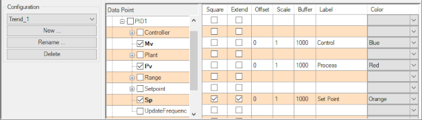
Data Points
You can select any number of data points to trend, from any data domain. Any point you select gets added automatically to the DataHub Historian or the selected External Historian configuration. The following options determine how the data will display in the chart.
- Square
Removes interpolation of the line between two data changes, giving the plot a step-like appearance. This is useful for square functions.
- Extend
When checked, this option extends the plot of a point's value as a straight line until the point changes value. With this option unchecked, no plot is shown until a point changes value. Then a straight line is plotted connecting the original value to the new value.
- Offset
A value entered here will be added to each value of the point, creating an offset plot. This lets you view widely differing values in the same window.
- Scale
A value entered here will be multiplied by each value of the point, creating an enhanced (or diminished if a fractional value) plot.
- Buffer
This value determines how many data changes for this point will be stored in the local history, to allow for scrollbacks to review recently plotted data.
- Label
Allows you to change the label for the point, whose default is the simple point name.
Working with the Display
There are a few features of the display that are not immediately obvious.
You can scroll backwards and forwards through the history of the trend using the left and right arrow buttons, or choose a specific date and time with the calendar and time selector. The double-right arrow button returns the display to real-time trending.
You can resize the trend display by dragging the gray borders on the left side or bottom. Move the mouse until you see a white, double-headed arrow, and drag.
To zoom in to a part of the display, drag the mouse over the area that you want to zoom in on. To zoom back out and resume real-time trending, click on the button at the bottom of the window.
To show a constant value as a horizontal line, you can simply create a DataHub point whose value never changes, create a plot for it, and check the Square and Extend options.
For other features, the QuickTrend display has a menu available on a right mouse-click.

Using this menu you can copy, save, or print the current display, as well as unzoom and undo a zoom or pan. You can also hide or show point values, and reset the scale to the default.
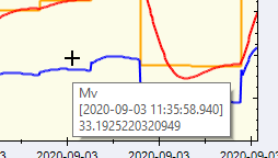
Chart
- Title:
The name of the chart, which will appear at the top.
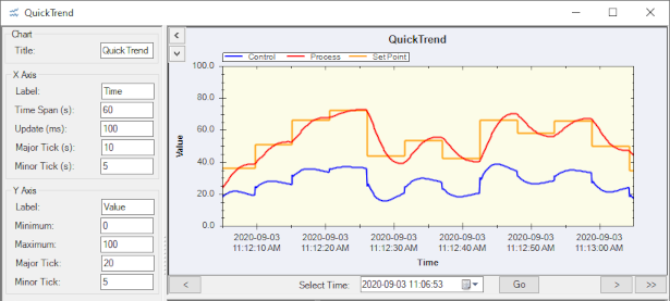
X Axis
The X axis displays the time coordinate.
- Label:
Any text string, displays at the bottom of the chart.
- Time Span (s):
The total number of seconds that the chart will span.
- Update (ms):
The update rate for the trend, in milliseconds.
- Major Tick (s):
The time interval between major tick marks, in seconds.
- Minor Tick (s):
The time interval between minor tick marks, in seconds.
Y Axis
The Y axis displays the value coordinate.
- Label:
Any text string, displays at the far left of the chart.
- Minimum:
The minimum value to include in the chart.
- Maximum:
The maximum value to include in the chart.
- Major Tick:
The value between major tick marks.
- Minor Tick:
The value between minor tick marks.